
Why Imperfect Design Feels More Human and Powerful
Perfect design can look polished and still leave people cold. The cleanest landing page, the flattest icon set, the most balanced grid, and the most refined color palette can all fail if the work feels empty.
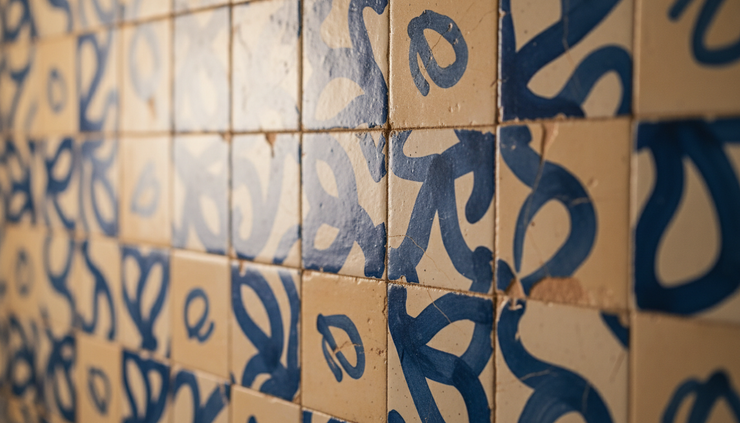
People do not respond only to order. They respond to longing, devotion, memory, tension, humor, pride, and care. Design that carries those emotions often has some friction in it. A hand-drawn line. A rough edge. A photograph that feels lived in. A texture that shows use. A layout that takes a small risk because the feeling demands it.
For small and medium businesses, that matters. Most brands do not win attention through scale alone. They win when people sense there is someone real behind the work. Imperfect, raw, and expressive design can help create that sense faster than sterile minimalism.

Perfection can remove the signs of life
Minimal design has value. It can make information clear, reduce noise, and help a business appear focused. The problem starts when clarity turns into emotional absence.
Many businesses adopt minimalism because it feels safe. White space suggests confidence. Thin type feels modern. Flat colors look clean. On their own, those choices are not wrong. Yet when every element becomes too smooth, the design can lose its human signal.
Human beings are drawn to traces of effort. A slightly uneven illustration says someone made this. A textured background says this came from a real material. A candid product image says this object exists in the world, not only in a mockup.
That trace matters because people often judge a business before they can explain their judgment. They ask silent questions:
Does this feel trustworthy?
Does this feel made with care?
Does this feel like it belongs to people like me?
Does this make me feel anything?
Sterile design may answer the first question well. It can look trustworthy. But if it does not answer the others, the brand becomes easy to forget.
Powerful design does not need to look messy. It needs to feel inhabited.
Imperfection helps people feel truth
A perfect thing can appear distant. An imperfect thing can seem closer because it carries evidence of process.
Think of a bakery that shows flour on the counter, irregular crusts, and handwritten shelf tags. Compare that with a bakery site that uses only flawless product shots on a pure white background. The second may look professional, but the first may create appetite, warmth, and trust faster.
The same applies to service businesses, nonprofits, makers, restaurants, consultants, builders, health studios, specialty retailers, and local providers. Rawness can make an offer feel grounded.
That does not mean every business should look rustic or handmade. Imperfection is not one style. It can show up through:
Photographs with natural light and real settings
Type choices with personality rather than generic polish
Illustrations that show the artist’s hand
Color palettes that carry mood instead of trend
Layouts with rhythm, contrast, and a touch of tension
Copy that sounds specific rather than over-smoothed
The goal is not to fake authenticity. People sense that quickly. The goal is to let the real character of the business come through before it gets cleaned out in the design process.
A polished brand can still feel human. The difference lies in what the polish protects. If it protects clarity, it helps. If it protects the brand from showing emotion, it weakens the work.
Emotion gives design a reason to be remembered
People remember what creates feeling. That feeling does not always need to be dramatic. It can be quiet devotion, patient craft, relief, belonging, nostalgia, desire, or confidence.
For many businesses, the strongest design direction begins with one emotional truth. A landscaping company might build around relief and pride. A family-owned restaurant might build around devotion and welcome. A financial consultant might build around calm after years of confusion. A boutique hotel might build around longing for escape.
Those emotions should shape the visual system.
If the feeling is longing, the design may need depth, shadow, open space, and images that suggest distance or anticipation. If the feeling is devotion, the design may need warmth, repetition, close details, and marks that feel cared for. If the feeling is defiance, the design may need heavy contrast, rougher type, and sharper composition.
This is where many brands go wrong. They choose a style before they name the emotion. The result looks fine, but fine is rarely enough.
A strong Content Marketing Strategy should do more than schedule posts or choose topics. It should define the emotional field the brand wants to own. Once that field is clear, design can support it across pages, emails, packaging, signage, photography, and long-form content.

The most human design has controlled imperfection
Raw design works best when it still has discipline. Random roughness can look careless. Controlled imperfection feels intentional.
That balance matters for small and medium businesses because trust is often fragile. A restaurant menu can use hand-drawn elements, but prices and dish names must be easy to read. A contractor’s website can use textured photography, but service information must be clear. A wellness brand can use soft, imperfect visuals, but booking details must feel reliable.
Think of imperfection as an accent that supports meaning, not a substitute for structure.
Keep the functional parts clean
Navigation, contact information, pricing clarity, product details, and calls to action should not become difficult in the name of expression. Emotion draws people in. Usability helps them act.
A good test is simple. If the expressive choice makes the message harder to understand, it needs adjustment. If it makes the message easier to feel, it may be doing its job.
Let one or two elements carry the rawness
A brand does not need every surface to be expressive. Too much texture, too many type styles, and too many irregular shapes can create fatigue.
Choose the design elements that will carry the human signal. For example:
Photography can show real people, materials, and environments.
Typography can include one distinctive display typeface.
Illustration can add warmth to otherwise clean pages.
Color can move beyond generic blue, black, and gray.
Layout can include one surprising break in rhythm.
This restraint helps the work feel professional without becoming lifeless.
Match imperfection to the brand promise
A luxury tailor and a neighborhood coffee shop can both use imperfect design, but not in the same way. The tailor may use subtle fabric texture, close-up stitching, and restrained asymmetry. The coffee shop may use handwritten notes, warm colors, and candid images.
The question is not whether imperfection fits. The question is what kind of imperfection fits.
Sterile minimalism often hides uncertainty
Many brands choose very minimal design because they do not know what they want to say. Minimalism becomes a shield. It avoids bad taste, but it also avoids commitment.
A plain black logo, a neutral palette, and a clean website can feel respectable. They can also make a business look interchangeable. If five competitors could use the same design without changing much, the work is probably not specific enough.
Specificity creates connection. A pet care company that shows mud, movement, and affection will feel different from one that uses generic icons and stock images. A home repair business that shows worn tools, real materials, and practical detail will feel more grounded than one that relies on abstract shapes. A specialty food brand that shows uneven surfaces, steam, crumbs, and hands at work will create appetite more naturally than one that removes every trace of production.
When a business searches for support with a phrase like Marketing agency near me, the better question is not only who can make the brand look modern. It is who can help uncover the emotional truth behind the business and translate it into design people can feel.
How to bring more feeling into design without losing professionalism
A more expressive design system starts with better inputs. Before changing colors or typefaces, define what the design needs to communicate emotionally.
Here is a practical way to approach it.
Name the core emotion
Pick one primary emotion and one supporting emotion. Avoid broad words like “happy” or “premium” if they do not say enough.
Stronger options might include:
Longing
Devotion
Relief
Belonging
Confidence
Curiosity
Care
Escape
Pride
This gives the creative work direction. It also helps teams make decisions without relying only on personal taste.
Audit what feels too clean
Look at the current website, printed materials, photography, packaging, and sales documents. Identify the places where the brand feels generic or over-polished.
Common signs include:
Stock images that look unrelated to the real business
Layouts that follow trends too closely
Copy that sounds like any competitor could have written it
Colors chosen because they are safe, not because they carry meaning
Product or service visuals that remove all texture and context
This audit often reveals that the issue is not poor design skill. The issue is a lack of emotional evidence.
Add texture where it tells the truth
Texture should connect to the business. A cabinetmaker can show wood grain, pencil measurements, sawdust, and joinery. A florist can show stems, water, wrapping paper, and hands arranging. A consulting firm may not have physical craft in the same way, but it can show notes, diagrams, real workshop materials, or client journey maps without looking staged.
The point is to show the world around the work.
Use photography with real presence
Photography is one of the fastest ways to move away from sterile design. Real spaces, real materials, real customers, and real process moments can create trust quickly.
The images do not need to be gritty. They need to feel observed rather than manufactured. Natural light, imperfect surfaces, human gestures, and honest context all help.

Imperfect design should still earn trust
There is a real risk in celebrating imperfection too broadly. Some design flaws weaken credibility. Broken alignment, poor contrast, unreadable type, inconsistent spacing, and confusing hierarchy do not feel human. They feel unfinished.
The strongest work separates expressive imperfection from technical weakness.
Expressive imperfection supports the message. Technical weakness gets in the way of the message.
A hand-drawn icon can feel warm. A blurry logo usually does not. A textured background can add depth. Low contrast text can frustrate readers. A candid photo can feel honest. A poorly lit image of an important product can reduce confidence.
This distinction matters because emotional design still has a job to do. It must help people understand, trust, and act. Rawness is valuable only when it brings people closer to the brand’s promise.
Signs that a design feels human
A human design system often has a few clear qualities.
It feels specific.
The visuals could not easily belong to another business.
It shows evidence of care.
Details suggest that someone paid attention.
It creates a mood quickly.
The viewer feels something before reading every word.
It allows some irregularity.
The design has rhythm, but not total sameness.
It supports real decisions.
The emotional pull leads toward a clear next step.
A sterile design may look complete. A human design feels alive.
FAQ
Why does imperfect design often feel more trustworthy?
Imperfect design can show evidence of real effort, materials, people, and process. When used with care, those details make a brand feel less manufactured and more believable.
Does imperfect design mean lower quality?
No. Strong imperfect design still uses clear hierarchy, readable type, good contrast, and consistent structure. The imperfections should add emotion, not create confusion.
Can professional service businesses use raw or expressive design?
Yes. The style may need to be more restrained, but professional businesses can use natural photography, distinctive language, tactile details, and warmer visual systems to feel more human.
Is minimalism a bad choice for small businesses?
Minimalism can work well when it serves clarity and reflects the brand’s character. It becomes a problem when it removes all personality and makes the business look interchangeable.
What is the best first step toward more emotional design?
Start by naming the feeling the brand should create. Once that emotion is clear, choices about color, photography, type, layout, and copy become much easier.
The takeaway
The future of strong design is not colder, cleaner, and more polished at every turn. People are already surrounded by smooth interfaces and generic visuals. What often stands out now is the work that feels specific, emotional, and made with care.
Imperfect design works because it brings back the human signal. It lets longing, devotion, craft, memory, and personality enter the frame. It gives people something to feel, not just something to view.
The best design does not chase mess. It uses imperfection with purpose. It protects clarity while allowing texture. It builds trust while showing character. For businesses that need to be remembered, that balance can be far more powerful than perfection.



Comments